What
Rebranding campaign
Digital ads
Print ads
Direct marketing
Banners
E-mailing
OOH
POS marketing
Social

Year
2020-2021

Brand positioning
Simplifying connections

Team
Senior Designer - Buket Mihrinnisa Uygur
Senior Creative Director - Neil Esposito
Creative Director Copy - Tim Woods

Optimum connects people to what matters most through fast, reliable internet powered by advanced fiber and terrestrial infrastructure. The rebrand centers on simplifying complexity, making connections feel effortless, intuitive, and valuable for consumers and businesses alike.

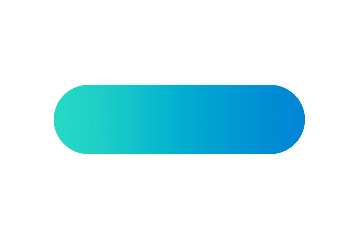
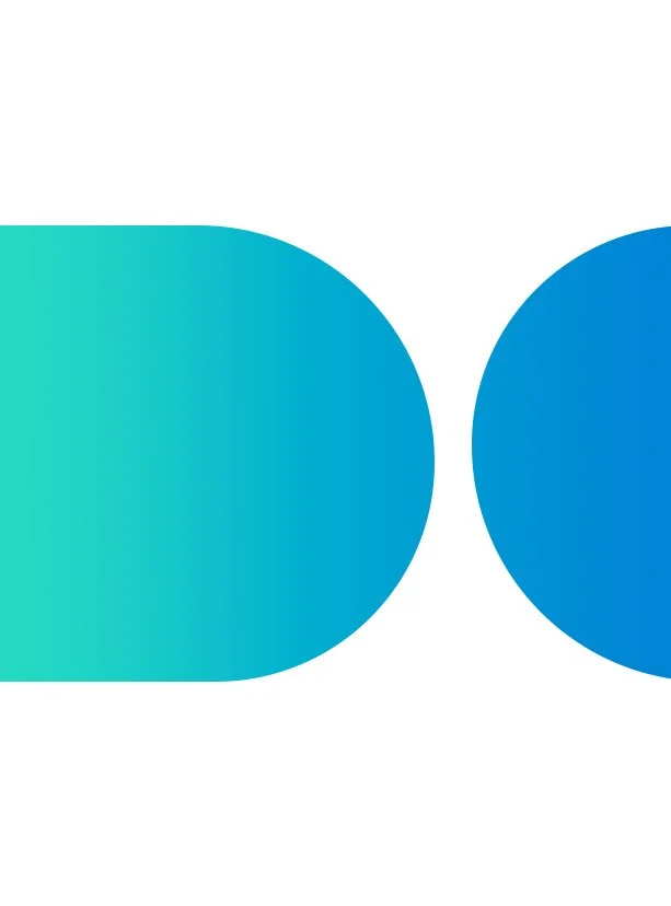
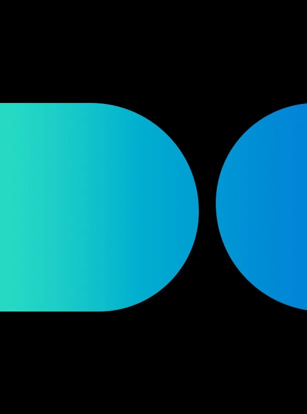
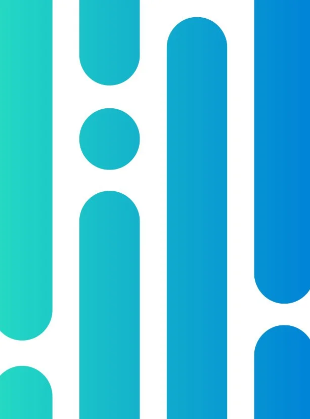
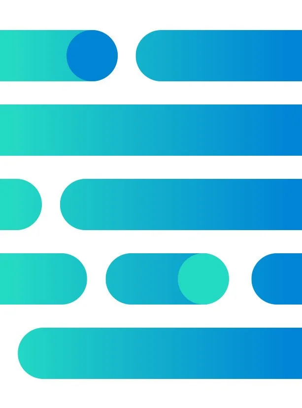
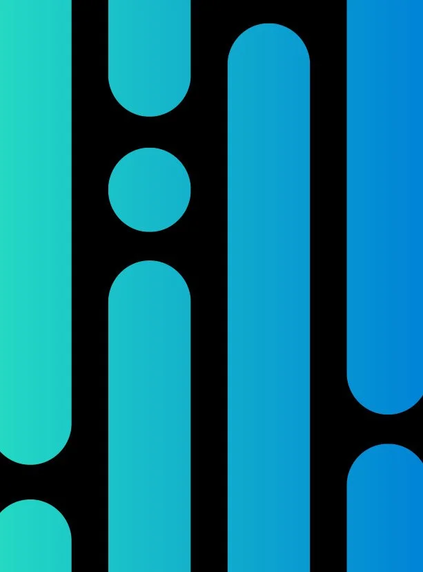
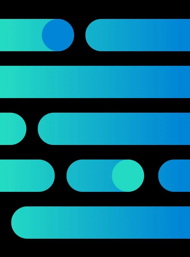
Inspired by the infinite blues of sky and ocean, the refreshed palette uses teal and blue gradients to express motion, scale, and possibility. Subtle gray tones add balance and depth, grounding the system while maintaining a modern, confident visual language. Together, the colors reinforce Optimum’s commitment to clarity, accessibility, and forward momentum.

In reimagining Optimum and Optimum Mobile’s brand identity, we focused on the beam as a central visual metaphor and identity system. The beam embodies our brand essence, symbolizing technology and connection. It seamlessly integrates Optimum in the East, Suddenlink in the West, and Optimum Mobile, creating a cohesive and recognizable visual language.

This concept is a vision of how Optimum’s brand can continue to represent its core values while evolving to meet the needs of our diverse customer base. The beam is distinctive, flexible, and easy to use, reflecting the simplicity and accessibility that Optimum strives to deliver.

Graphic System Foundation

Previous
Previous

Invisible Cities

Next
Next

IKSV - Filmekimi Film Festival 2009