What
Concept
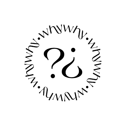
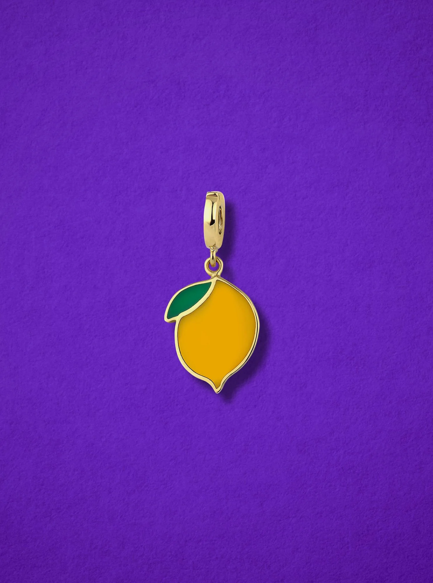
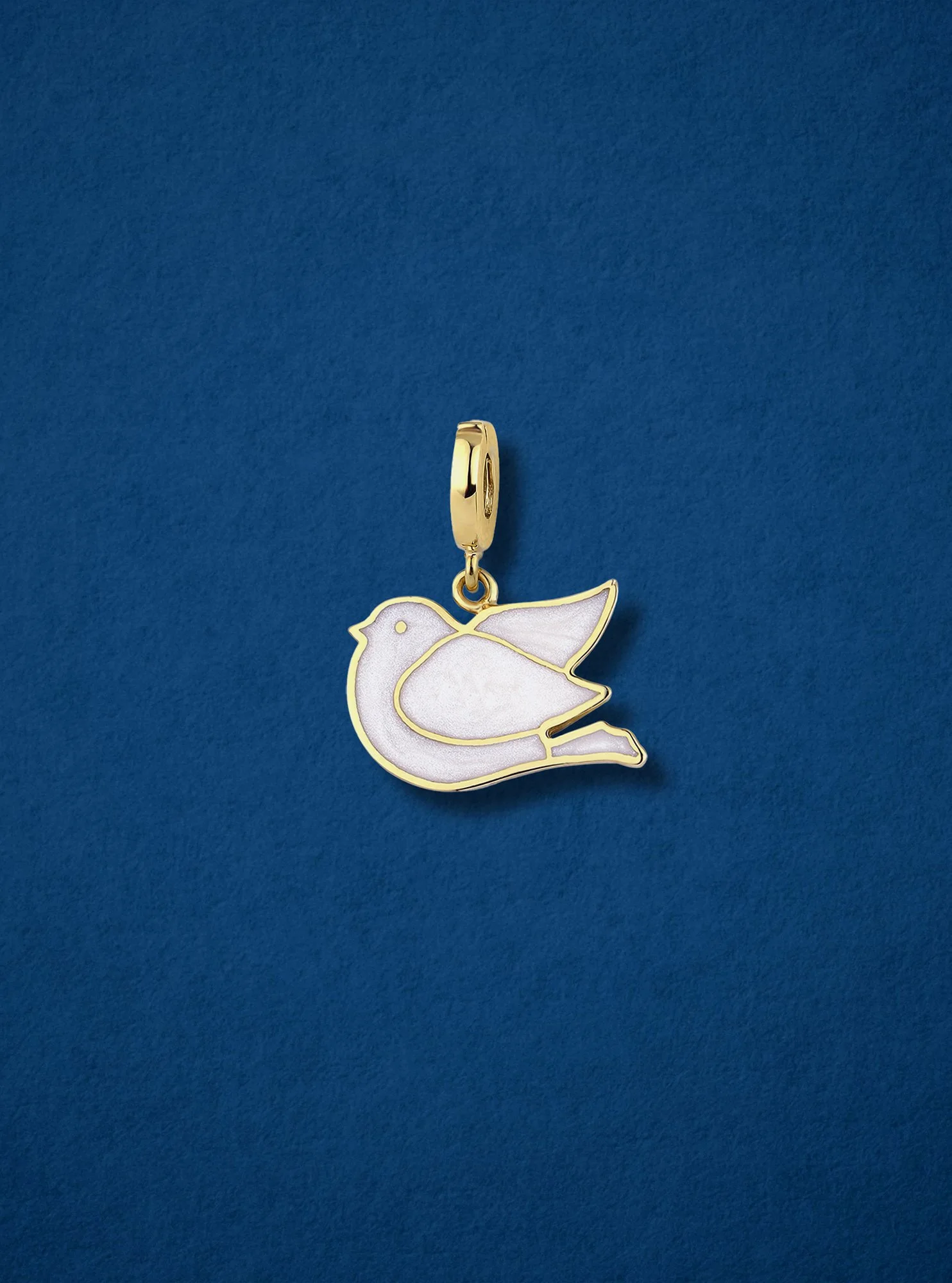
Logo
Emblem
Animations
Web design
Social
Client
whywhy Fine Jewelry
Concept & design - Buket Mihrinnisa Uygur
A bold, self-initiated fine jewelry brand identity rooted in self-expression, individuality, and modern femininity.
Role
Founder & Creative Director, defined the brand vision and led all visual identity, design systems, and creative execution.
What I Did
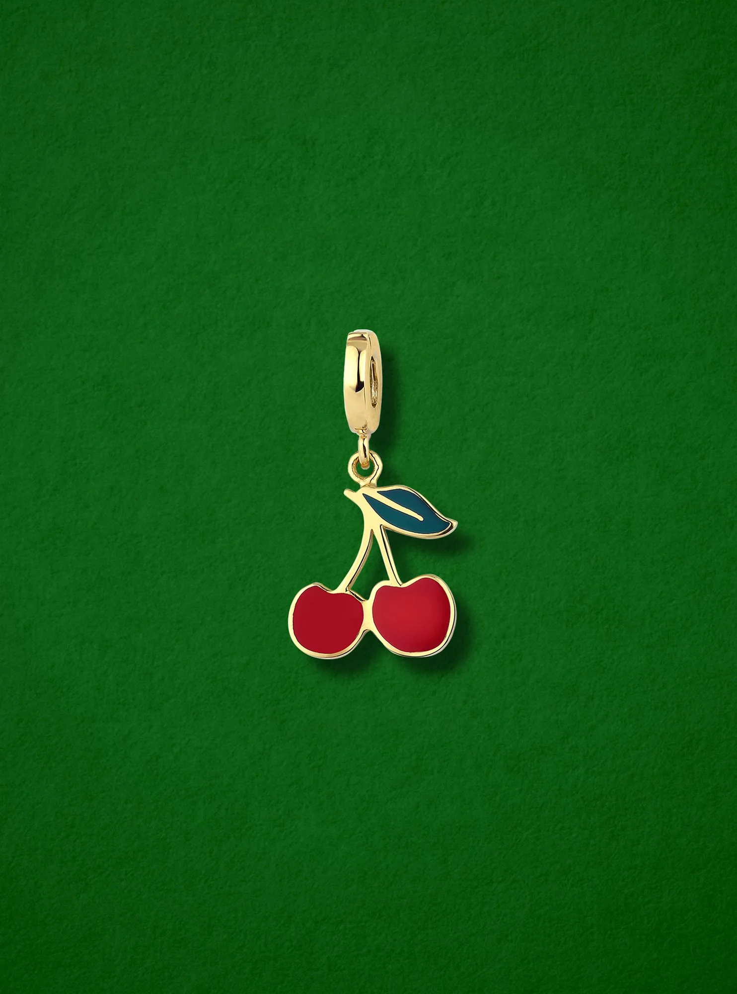
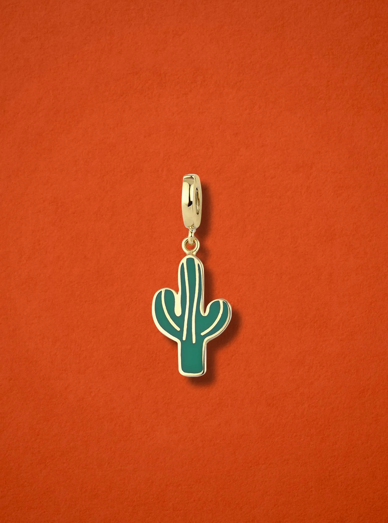
- Developed a distinctive visual identity blending vintage references with a modern, editorial edge
- Designed a flexible brand system spanning social, e-commerce, packaging, and digital storytelling
- Established color, typography, and styling principles to support product launches and content creation
- Created visual frameworks optimized for social-first content and conversion-focused e-commerce
Strategy — Why This Works
In a saturated fine jewelry market dominated by minimal sameness, whywhy stands out by pairing emotional storytelling with strong visual codes. The identity balances nostalgia and modern confidence, creating a brand that feels personal, expressive, and culturally relevant—especially to self-purchasing, style-driven consumers.
Impact
- Positioned whywhy as a confident, statement-driven fine jewelry brand
- Built a recognizable visual language that performs across social, product pages, and campaigns
- Created a scalable system that supports rapid content creation without losing brand consistency
Social:
- Designed bold, high-contrast visuals optimized for Instagram, Pinterest, and short-form discovery
- Established repeatable content patterns to build recognition and save production time
E-commerce:
- Applied the brand system to PDP imagery, banners, and storytelling_toggle layouts
- Balanced editorial styling with clarity and trust to support conversion